

SMSA / Dragon Breath Studies
01 — Dragon Breath / Illustrated Brand Concept 02 — SMSA / Hoodie Identity Application 03 — Dragon Emblem / Color Explorations 04 — Flame Wordmark / Three Color Variations
Fire Translated Into Form
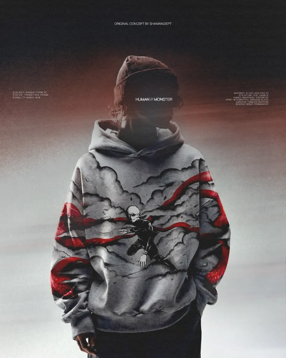
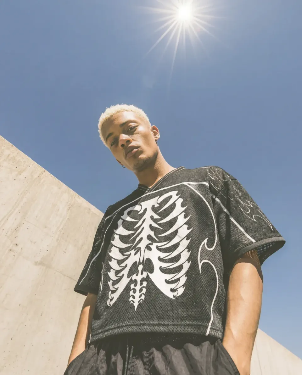
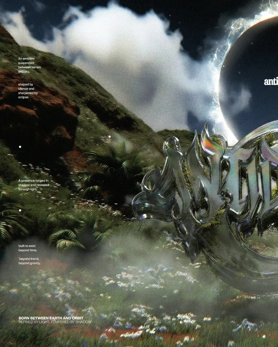
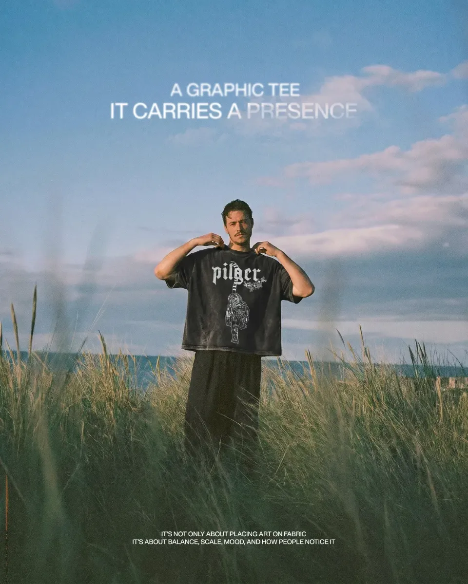
SMSA is an experimental wordmark and logo concept developed by Shaman Dept, exploring the visual energy of fire through custom typography and illustrated symbolism. Inspired by the movement and intensity of flames, the lettering features irregular silhouettes, flowing edges, and sharp extensions that transform each character into an expressive graphic form. A fire-breathing dragon illustration complements the typography, introducing a powerful visual element through bold contours, dynamic movement, and a contrasting palette of charcoal, orange, and warm yellow. The wordmark is explored across three distinct color treatments, revealing how a consistent letterform can communicate different visual moods while maintaining its recognizable character. Together, the lettering and illustration establish a cohesive graphic direction, further explored through streetwear applications and editorial presentations. Creative Direction Flame Lettering / Dragon Illustration / Custom Wordmark / Expressive Typography / Streetwear Graphics
Comments