

SHMN+ Letterform Experiments
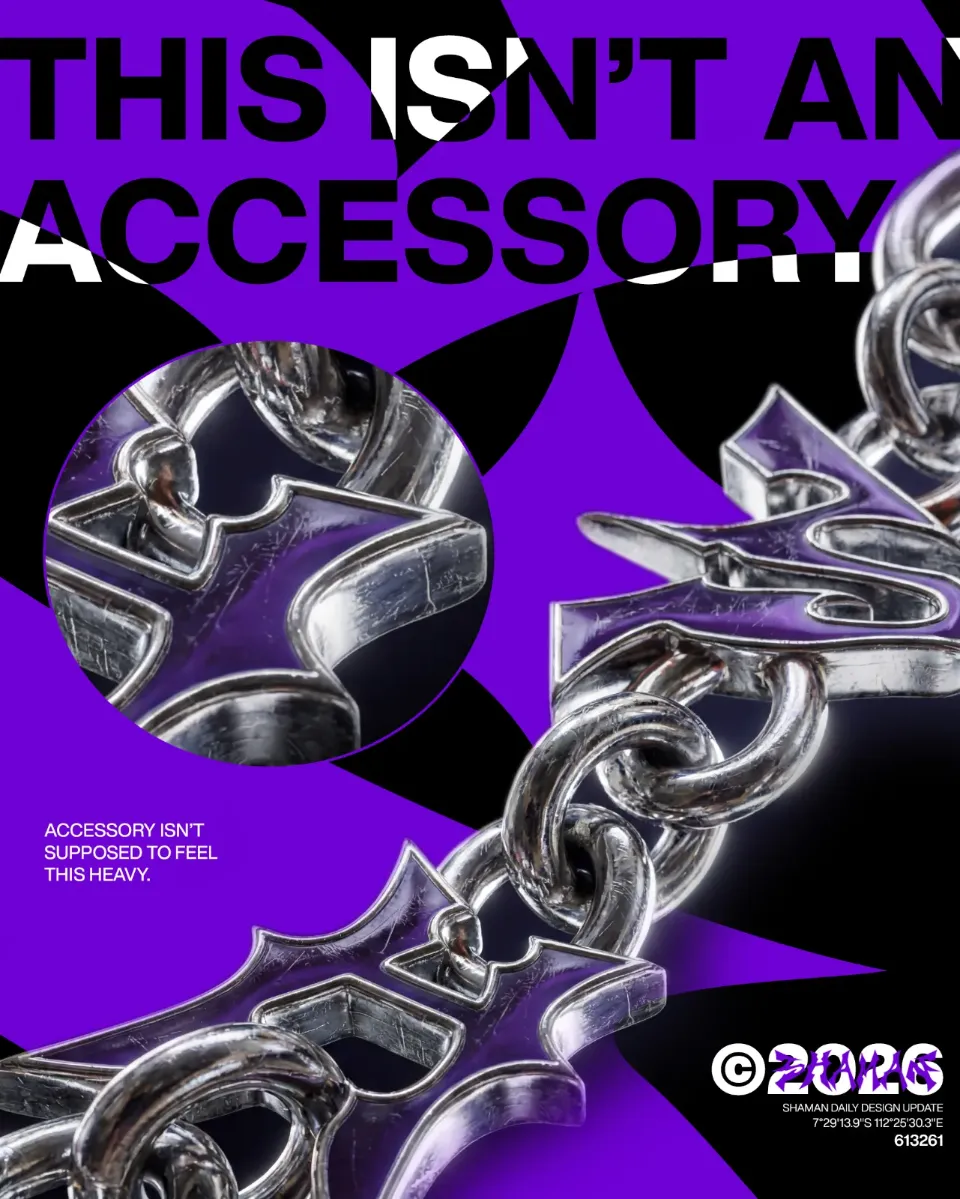
01 — S / Sharp Chrome Letterform 02 — H / Angular Letter Construction 03 — M / Sculptural Metallic Form 04 — N / Experimental Sharp Geometry 05 — + / Chrome Symbol Exploration 06 — SHMN+ / Complete Lettering System
SHMN+ Form Beyond Function
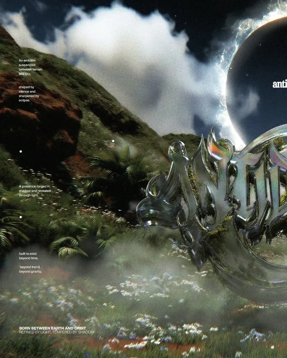
SHMN+ is an experimental typography study developed by Shaman Dept, exploring how the studio's initials can evolve beyond conventional lettering. Each character is reconstructed through exaggerated sharp edges, elongated spikes, angular cuts, and fluid metallic surfaces. The result blurs the boundary between typography and sculptural objects. Inspired by aggressive letterform construction and futuristic metallic aesthetics, the project explores the balance between visual intensity, form, and recognition. Rather than treating letters as conventional typography, SHMN+ approaches each character as an independent visual form while maintaining a cohesive identity across the collection.
Comments